The Role of Colors in the Perception of Spaces and in the Practice of Minimalism

The Transformative Power of Color
Color plays an indispensable role in our perception of space, influencing not just aesthetics but also our emotional and psychological responses. When we unlock the potential of color, we can manipulate both the atmosphere and functionality of our environments. This is particularly significant in contemporary design, where the principles of minimalism advocate for simplicity and intentionality.
Key influences of color in space perception include:
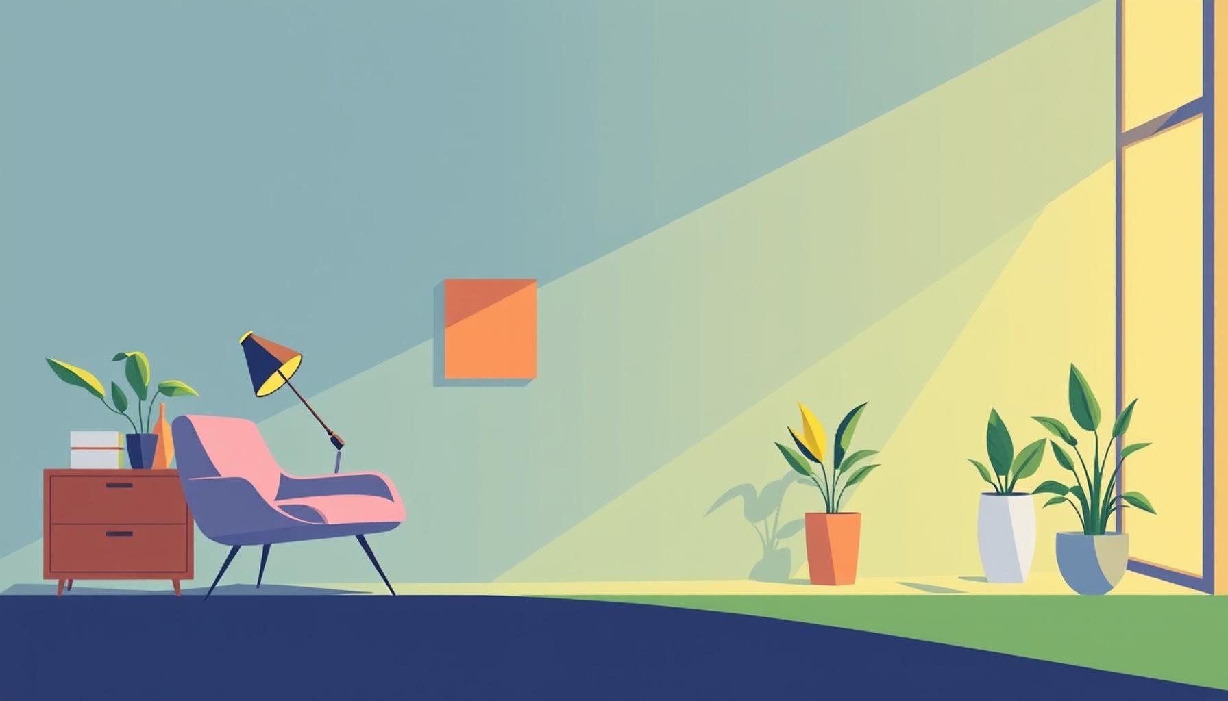
- Warm tones: Colors such as reds, oranges, and yellows often invoke feelings of intimacy and comfort. These hues can make a large room feel cozier and transform sterile environments into welcoming spaces. For example, a living room painted in soft terracotta can create a nurturing atmosphere ideal for gatherings and socializing.
- Cool tones: Shades of blue, green, and violet are known for promoting calmness and spaciousness. When applied in areas like offices or meditation rooms, these colors can enhance focus and tranquility. A breezy aqua on the walls can replicate the feeling of being at the beach, thus reducing stress levels and boosting creativity.
- Neutral palettes: White, gray, and beige are fundamental to minimalist design. These colors instill a sense of tranquility and allow the beauty of form and function to take center stage. A minimalist workspace drenched in soft whites and shades of gray can help eliminate distractions, making it easier to concentrate on tasks at hand.
In the practice of minimalism, every color choice becomes a critical part of the design narrative. For instance, a monochromatic color scheme—where varying shades of a single color dominate—can create a cohesive and serene environment. This approach provides clarity, reduces cognitive overload, and enhances focus, making it ideal for both living spaces and professional settings.
Moreover, understanding the psychology behind color can lead to more informed decisions that resonate with personal preferences while adhering to minimalistic principles. For example, incorporating a splash of a vibrant hue in an otherwise neutral room can serve to create a focal point, adding interest without cluttering the space.
As we delve deeper into the intricate relationship between color and space, it becomes evident that every choice reflects our values, aspirations, and emotional needs. This understanding empowers us to create environments that not only align with our personal style but also enhance our well-being. A well-thought-out color scheme can transform a simple room into a sanctuary where individuals can thrive mentally and emotionally, making the exploration of color a worthy venture in the minimalist journey.
DIVE DEEPER: Click here to discover the effects of organization on mental health
Understanding Color Psychology in Design
To appreciate the influence of color on space perception within minimalist design, it is essential to delve into the fundamentals of color psychology. The psychological effects of color are profound and vary significantly across different cultures and individual preferences. For instance, while blue is universally acknowledged for its calming effects, it might evoke feelings of sadness for some individuals, showcasing the complexity of emotional responses towards color. This intrinsic relationship can be pivotal in the way we choose to illuminate our living and working environments.
Colors not only affect how we feel but can also change how we perceive the size and shape of a space. Understanding these effects is vital for anyone navigating the minimalist aesthetic, where the goal is to maximize impact with minimal elements. Here are some primary effects that colors have on spatial perception:
- Light Colors: Utilizing light colors such as whites and pastels can create an illusion of expansiveness. Spaces bathed in these hues can feel larger and more open, making them ideal for smaller areas, which is a common focus in minimalist design.
- Dark Colors: While darker shades can add depth and sophistication, they can also make a space feel constricting and intimate. In a minimalist context, a well-placed dark accent wall may create contrast that highlights other minimalist elements without overwhelming the simplicity of the design.
- Contrast and Complement: The interaction between colors can amplify their visual impact. A well-executed color contrast can draw attention to specific features or designs in a room while maintaining an overall balance, embodying the minimalist notion of simplicity with intentional focus.
In minimalism, the aim is to strip away excess and emphasize key elements, allowing colors to serve as guiding focal points. A carefully curated palette can integrate seamlessly into a sparse environment, highlighting objects and enhancing their emotional resonance. For instance, a bright yellow chair set against white walls does not just add color; it creates a point of interest that encourages the eye to flow throughout the room.
Furthermore, the use of natural light in conjunction with color choices can redefine spatial experiences. Rooms that take advantage of ample sunlight paired with soft, lighter colors can evoke feelings of warmth and openness. Conversely, spaces that rely on artificial lighting paired with darker palettes might lead to a more subdued atmosphere, which may benefit focused activities like reading or studying.
Ultimately, the interplay of color in minimalist environments not only enhances aesthetic appeal but also influences wellbeing. Properly chosen color schemes can assist in reducing anxiety and fostering productivity, reinforcing minimalism’s core values of clarity and mindfulness. As we further explore how colors interact with space, it becomes clear that these choices go beyond mere visual appeal—they reflect deeper emotional needs and can even impact our day-to-day functionality in profound ways.
| Advantage | Description |
|---|---|
| Enhances Mood | Different colors evoke specific emotions. For instance, blues can promote calmness while yellows can elevate energy levels. |
| Defines Space | Color usage can alter the perception of room size. Light shades can make a space feel larger, whereas dark hues can create intimacy. |
| Minimalist Harmony | In minimalism, strategic color choices foster a sense of tranquility and balance, making the environment visually cohesive. |
| Focus and Clarity | Using neutral colors in minimalistic designs helps maintain focus, eliminating distractions in one’s living or working space. |
Understanding the profound influence of colors in minimalism allows individuals to create serene environments that adhere to their aesthetic preferences while enhancing their emotional well-being. Each color choice carries meaning and impacts how we relate to and perceive our surroundings. With this awareness, one can construct spaces that not only look appealing but also resonate emotionally, engaging the observer to discover the deeper significance of simplicity in their habitat.
DISCOVER MORE: Click here to learn how organization impacts your mental well-being
The Impact of Color Schemes on Minimalist Aesthetics
In the pursuit of minimalism, the color scheme plays a crucial role in not only defining the aesthetic but also shaping psychological responses and sensory experiences. When we consider the overall atmosphere a space offers, it becomes clear that color serves as a foundational element that enhances functionality. For instance, when creating a serene and mindful atmosphere, many minimalist designers opt for monochromatic palettes. These simple, uniform color schemes allow spaces to feel cohesive and undistracted, which can promote relaxation and mental clarity.
One of the most compelling examples of this is the use of neutral colors, such as grays, beiges, and whites. These shades are quietly sophisticated and provide a subtle backdrop that amplifies light and spatial perceptions. In spaces like open-concept living areas or modern offices, incorporating neutral colors fosters an unobtrusive environment, allowing individuals to concentrate on tasks without visual clutter. Moreover, these colors can adapt well to seasonal decor changes or personal accessories, maintaining the minimalist ethos while still allowing for personal expression.
Additionally, the concept of accent colors cannot be overlooked in minimalist design. Strategically placed pops of color can inject vitality and energy into a room without overwhelming the essence of minimalism. For instance, vibrant green plants, rich blue artwork, or bold red furniture pieces can stand as singular focal points in an otherwise muted setting. This principle is important in fostering visual interest and providing emotional stimulation, which might be particularly appealing in spaces meant to inspire creativity—such as art studios or collaborative workspaces.
Furthermore, the temperature of colors also influences how we perceive space. Warm colors like reds and yellows can infuse areas with energy and intimacy, making rooms feel cozy and inviting. In contrast, cool colors typically associated with tranquility, such as blues and greens, can create a refreshing and calm atmosphere. In minimalist settings, leveraging this temperature can lead to profound impacts on human behavior—warm colors might promote social interaction, while cool colors might encourage solitude and introspection.
Another important aspect to examine is the use of color transitions. The way colors flow from one space to another can dictate the rhythm of navigation through a home or workspace. By utilizing gradients or complementary tones that flow seamlessly, designers enhance the continuity of spaces, making transitions feel more organic. This approach is particularly powerful in large areas, where a sense of uniformity can mitigate feelings of fragmentation, ensuring each part of the space contributes to the overall minimalist vision.
Moreover, the role of bold color choices against minimalist backdrops cannot be overstated. High-impact colors—think deep navy in a crisp white living room or a striking orange against a pale gray—can create a dramatic essence without cluttering the visual field. In these scenarios, the tension between color and minimalism becomes a dialogue of simplicity and statement, fostering a compelling narrative in design.
In essence, the thoughtful application of color within minimalist environments transcends mere aesthetics; it helps craft experiences and shapes interactions, elevating both emotional and functional aspects of the spaces we inhabit. As individuals continue to explore minimalist lifestyles, the study of colors—and their potent influence on perception—remains a vital conversation in design.
DISCOVER MORE: Click here to learn about how organization affects your mind
Conclusion: The Integral Connection Between Color and Minimalism
The exploration of colors in the perception of spaces reveals their profound influence on the practice of minimalism. From the subtlety of neutral tones to the impactful statements made by bold hues, color choices are central to the minimalist ethos, often molding not only the visual appeal but also the emotional resonance within environments. By harnessing the power of color, designers and individuals alike can create spaces that foster tranquility, creativity, and focus—key attributes of a minimalist lifestyle.
As we navigate our daily lives, the environments we inhabit undeniably shape our experiences and interactions. The strategic use of color can promote a sense of harmony, ensuring that every element within a space contributes to the overall narrative. Moreover, color temperature and transition further dictate how we experience a room, directing emotional responses and enhancing our connections to the space. The idea that a simple change in color can redefine our perception is both intriguing and essential for anyone interested in minimalist design.
By continuing to examine the interplay of colors and minimalist principles, we open a pathway to not only aesthetic appreciation but also an understanding of the psychological effects they carry. As minimalism gains traction in a world often filled with chaos, the role of color in this movement becomes even more critical. Engaging with these concepts invites further exploration, encouraging readers to reflect on how their choices of color can enrich their living and working spaces. Ultimately, the awareness of color’s significance in minimalism empowers individuals to create environments that truly reflect clarity, purpose, and serenity.
Related posts:
Multifunctional Furniture: The Key to Optimizing Spaces in Minimalist Lifestyles
Functional Organization: How Minimalism Can Transform Your Workspace
Creating Functional Zones: How Spatial Organization Enhances Productivity in Minimalist Environments
Smart Furniture: Innovative Solutions to Maximize Space in Minimalist Environments
Transforming Outdoor Spaces: Space Optimization Strategies in Minimalist Gardens and Balconies
Simplifying Life: Space Optimization Solutions for Minimalist Closets
Beatriz Johnson is a seasoned digital lifestyle strategist and green tech writer with a passion for demystifying sustainable technology and eco-conscious living. With over a decade of experience at the intersection of innovation and sustainability, she specializes in topics like smart home solutions, renewable tech applications, and global trends in green digitalization. Through her work on our platform, Beatriz empowers readers to make informed choices about adopting planet-friendly technologies while optimizing their digital lives for both efficiency and environmental impact.